


Final Revisitations: The Aztecs, The Claws of Axos, The Green Death & The Ark in Space
9 November 2015And so the primary purpose of Velvet Jacket is finally achieved with these four revised covers for stories that had a Special Edition release with extra special features. These make the site complete, with covers for every Classic Doctor Who story released on DVD - and it's only taken me 14 years! Still, no small achievement (particularly as the ever-improving official covers made replacements less valuable) and I've enjoyed doing them all on the whole.
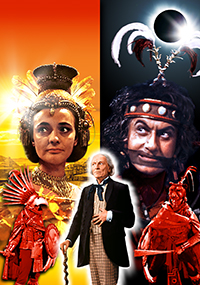 'The Aztecs' was a cover I was particularly keen to revisit but had tried earlier to devise a new design and struggled to find something I was satisfied with using the images available to me. Sitting down more recently, perhaps helped by a determination to get the cover finished at last, the layout came to me much more readily.
One reason for the desire to redesign this one completely was that the original was one of my 'big close-up' covers, a style borne out of limited photo resources at the time and one I didn't stick with beyond the early days. The photo of the Doctor was also one I was very unhappy with the quality of, again a result of little choice but also hailing from the time before I really knuckled down to colourising black-and-white photos. There are several nice colour images from 'The Aztecs' and, this being only my second cover for a Sixties story, I was still trying to use as many colour photos as I could. Indeed, I was able to do so mostly for the new cover too (thankfully, as I didn't relish trying to colour in all of Barbara's feathers if I'd had to use a b/w image). So both Barbara and Tlotoxl here are original colour images, although corrected and adjusted to fit the backgrounds, of course. Having placed a vista of the Aztec city behind Babs, I had planned to have Tlotoxl inside the temple when I realised the light and dark halves - reflecting their natures - also leant themselves to day and night scenes, which allowed me to include the lunar eclipse that's key to the climax of the story. Limits in its positioning meant the moon would fall behind the story number on the final cover so I broke with tradition slightly and did away with the circle around the number.
I wanted some red element on the cover to represent the bloody sacrifices in the story but didn't want it to override the colour images I was using, so I added the two warriors in strong red tones (which saved me a colourising job) as well as to represent the plurality of the story's title (even though one of them is Ian, of course). I also love those animal headdresses. Finally, the Doctor was colourised after patching part of his arm and jacket where he had been obscured by another character in the original photo. I did consider flipping him so he was looking askance at Tlotoxl, but he looked odd and it still seemed fitting to the story that he would be eyeing Barbara equally as suspiciously.
Download the revised AZTECS cover here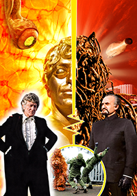 This is basically just an update with some better photo sources as I was happy with the design and most of the execution of the original. Mainly I wanted to redo the Doctor and Master as I knew I had better images now, which also allowed me to make them larger in the design. I hadn't planned to mess with the other elements at all, although it's hard not to notice small niggles when I reopen these old files. In the end I also redid the Golden Axon as I now had a digital copy of the photo rather than having to use a scan from a printed source, which is always affected by print screening. In doing so I decided the right-hand side of his face looked better and so flipped him, unsure of why I hadn't done this in the first place.
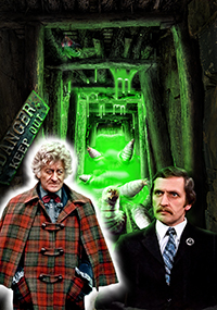 The main goal for 'The Green Death' was to include a shot of Stevens as the main villain of the piece, something I had been unable to do first time round. This meant losing the green miner, which was a bit of a shame but the quality of that photo wasn't brilliant anyway. I also found a good-quality colour image of the Doctor in his tartan ulster, which I remembered being what I wanted to use originally but had only then been able to find black-and-white versions.
When it came to the background, I kind of liked my original home-made coal mine but it did feel rather naive in its composition so I looked for some genuine photos of mine tunnels. I particularly wanted something with wooden pit props, otherwise it would just look like any rock tunnel. My search wasn't as successful as I hoped but the final choice (which I think is actually an American goldmine) fitted the layout best. I knew much of it would be obscured by green slime anyway. The final layout had less space for maggots too, but I was able to make the lead grub a bit more interesting by compositing it to be rearing up and spitting at the Doctor.
Download the revised GREEN DEATH cover here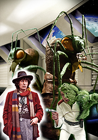 Finally, like 'The Claws of Axos', 'The Ark in Space' was going to be just a case of upgrading the photos used and for some time I've been holding onto any decent photos of Wirrn I came across. But like 'The Green Death' it turned out to be a bit more involved.
The only image I wanted to change was that of the Doctor, although I had no particular shot in mind and ended up using one of the publicity stills of Tom and the Daleks taken to promote 'Genesis of the Daleks'. The rest of the cover uses exactly the same source images as the original but all completely redone from scratch. First up was the mutating Noah, which I was keen to approach again using relatively decent screengrabs from the DVD rather than the ropey VHS screenshot I had been stuck with previously. I was also able to combine several shots to fill him in below the waist (as it were) so that he didn't have to sit too low down in the composition. I also replaced his gun with a grab from the close-up when he drops it at the Doctor's feet, just to improve the level of detail slightly.
For the main Wirrn, although the source image was better quality it still required heavy adjustment of the colouring to remove the blue lighting (it's from the scene where they enter the shuttle cockpit) and adding in more of the body as I couldn't be certain how much would be obscured by Noah. One other advantage was that the image was less cropped and featured the Wirrn's full feelers, allowing me to have them overlap the logo on the final cover. The background Wirrn is actually the dead Queen, taken from a shot of her body lying on the floor then rotated 90 degrees.
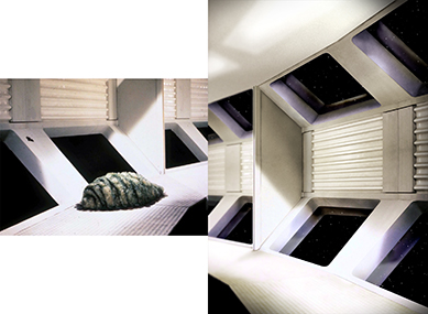 Finally (actually the first step) I recreated the Ark corridor using the same single photo source as previously (see right). I was not displeased with my original attempt but knew that with a better image (from the DVD's photo gallery) and ten-odd extra years of experience I could now do it better. Not only was the finished creation clearer, I was also able to correct a mistake in the number of ridges on the wall panels (where previously there had been too many, and the number changed as you looked along the wall). I also added some reflections of the window frames to suggest glass so that the windows didn't look quite so much like mere holes, although in the final cover they're largely obscured.