


Spearhead from Space revisited, The Ambassadors of Death & The Mind of Evil
20 November 2013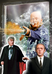 Like 'The Caves of Androzani', it has taken me some time to rework the cover for the re-release of 'Spearhead from Space' because while I knew I wanted to make changes to the original, I couldn't quite decide what and how. These were some of my earliest covers, when I was still working out my style and photo sources were scarcer. While I still like some elements of the original 'Spearhead' illustration - the Auton emerging from the bushes and the meteorites - the rest I was keen to change. Another reason to update this cover was it was the only one where I'd used a complementary colour for the text rather than a tint of the background colour - why, I can't remember, as I didn't do it on any other covers.
One starting point was a wish to include Channing on the new cover. I don't think I had been able to find any usable photos of him originally but knew that I'd seen some since. While simply adding him in somewhere behind/beside the Auton would be a squeeze, it was actually in trying to recreate the background that the cover floundered. The original image of trees was really too small for purpose, but I couldn't for the life of me find a suitable photo of trees but with a clearing for the meteorites to land in. You'd think there would be tons online but nothing felt like it would work, especially with the more confined space I had owing to fitting in an extra character. So the cover went on a back burner for a time while I tried to think of alternative designs.
It was only recently that a brainwave struck: what was the most iconic scene of the story? The Autons breaking through the shop window, of course (even though it's unseen strictly speaking). Knowing that I only had screengrabs of Autons to use, and that the clearest of these was the shot I'd used originally, I realised the outstretched gun arm could be smashing through a window, creating a dramatic background for straightfoward foreground figures of the Doctor and Channing. It took a lot of cutting and pasting from multiple photos of shattered glass, and the creation of some shard-of-glass brushes, but I'm rather pleased with the result. I've possibly overdone the amount of flying glass a bit, but I needed to convey the sense of action in a limited amount of space. I was going to have this be a shop window but having to use a boiler-suited Auton made this feel a little awkward. Once I realised you wouldn't be able to see much of the background anyway, I decided he may as well be breaking into the Seeley's cottage, so found an appropriate (if rather large for a cottage) window frame and gave him a wooded background. While the Auton himself is a fresh screengrab from the newly cleaned up DVD (sadly I don't have the Blu-ray), his gunfire is taken from my original cover as I rather liked the effect I'd achieved and wasn't sure I could recreate it as well.
Download the revised SPEARHEAD FROM SPACE cover here
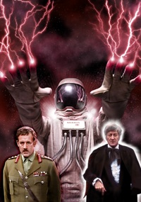 My 'Ambassadors of Death' cover was always going to feature one of the titular astronauts reaching out because, well, they're just great images. The difficulty came in finding the best one of several possible poses. There is one with him reaching out just one arm, which I thought might fit my asymmetrical cover layout but in practice didn't. The two-arms-out pose worked best, but finding a decent shot proved tricky. Many of the best quality versions I could find were small or cropped and in the end I used about five different photos composited together to try to get the cleanest, sharpest image I could. I'm sure in the Radio Times archive, for which magazine these shots were originally taken, there's a single clear photo that would have been perfect, but we non-commissioned artists must work with what we can find.
One question was what to do with the visor; I wanted to do more than have just a blank visage. There's a photo of an unmasked Ambassador and I thought of having this dimly visible inside the helmet. However, as the alien was facing slightly to one side and, with the low angle shot of the spacesuit, wherever I positioned the face looked wrong. Then, when I had the idea of mimicking the Ambassadors' deadly touch with some lightning bolts from his fingers, having these reflected in the visor seemed natural and effective. Shots of General Carrington are few so he is again a combination of body and head screengrabs.
Download the final AMBASSADORS OF DEATH cover here
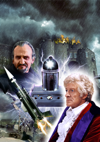 It was only while working on this illustration that it occurred to me to wonder whether the title 'The Mind of Evil' refers to the Keller creature, as I'd always assumed, or the Master himself. Either way, these were the obvious inclusions for my cover, even though I pretty much knew I'd have to see if I could composite the Keller machine from screengrabs. Other possibles were Mailer and Chin-Lee, but lack of suitable photos ruled them out: the former only shows up clearly in the shot of him with Jo on the stairs and I didn't want to include her (no disrespect to Katy), while most of Chin-Lee's shots are publicity ones where she's smiling.
That left more scenic elements to consider. The missile was an obvious choice: relevant and there are several good pictures of it, although I chose to liven it up with some launch blasts - inaccurate to the story but more dramatic on a cover. I did a search online for photos of Dover Castle, the location for Stangmoor Prison, and found several good shots of the tower we see on screen as the prison's entrance. I added the stormy sky, some atmospherics and, just for fun, a burning roof. Come on, surely in one of the many riots that take place in this story, someone will have set something on fire! Or think of it as representing the Doctor's fear when cornered by the Keller machine. I spent some time playing with different joins between these two scenes, finally settling on a rippled swirl reminiscent of the Keller machine's teleporting effect, only for most of it to be covered by foreground figures and effects. Oh well.
I had a really good high-resolution shot of the Doctor so that was an obvious choice, even though there are others taken at the same time that have him less in profile, which would have been preferrable but I still think this eyeline works. The Master's needed realigning, however. In the original he's looking left, and I tried flipping his whole head, as well as placing him on the right and flipping his body, but neither looked right, so I just blanked out his eyes and painted in new ones. It's harder than you might think to do this without people ending up looking cock-eyed, and his squinting probably helped here, but I think I got away with it. I couldn't find a clear, front-on shot of the Keller machine in any of the episodes, so this is a composite of a close-up of the upper tank section and one of the base distorted to straighten out the perspective. I then patched in close-ups of some of the controls to sharpen up the details. And to make it a bit more gruesome, I made the creature inside (glimpsed in episode 6) more visible through the tank.
Download the final MIND OF EVIL cover here
I've also uploaded a new cover for 'Inferno'. The front illustration is the same as before as I was happy with the original design (although I did redo the shot of the Primord with a better one from the original disc's photo gallery) but I've totally redone the actual cover, with new text to list the extra extras on the re-release and different photos on the back. As colour shots from 'Inferno' are exceedingly limited, I've used a couple of black-and-white images rather crudely colourised but sufficient for their size, I hope.
Download the revised INFERNO cover here